Chapter 7 Studying relationships between two factors
7.1 Producing cross tabulations
In earlier sessions we have covered how to run frequency distributions using the table() function. Cross tabulations, also called contingency tables, are essentially crossed frequency distributions, where you plot the frequency distributions of more than one variable simultaneously. This semester we are only going to explore two-way cross tabulations, that is contingency tables where we plot the frequency distribution of two variables at the same time. Frequency distributions are a useful way of exploring categorical variables that do not have too many categories. By extension, cross tabulations are a useful way of exploring relationships between two categorical variables that do not have too many levels or categories.
As we learned during the first week we can get results from R in a variety of ways. You can produce basic tables with some of the core functions in R. However, in order to produce the sort of cross-tabs we will use, I suggest you install and load the package gmodels. This package allows you to produce cross tabulations in a format similar to the one used by commercial statistical packages SPSS and SAS. Since some of you may have some previous experience with SPSS we will use the SPSS format. Cross-tabs with this package are more useful for our purposes than the default you may get with the core R table() function.
We will begin the session by loading again the BCS 2007/2008 data from previous weeks.
##R in Windows have some problems with https addresses, that's why we need to do this first:
urlfile<-'https://raw.githubusercontent.com/jjmedinaariza/LAWS70821/master/BCS0708.csv'
#We create a data frame object reading the data from the remote .csv file
BCS0708<-read.csv(url(urlfile))
We will start by producing a cross tabulation of victimisation (“bcsvictim”), a categorical unordered variable, by whether the presence of rubbish in the streets is a problem in the area of residence (“rubbcomm”), another categorical unordered variable. Broken windows theory would argue we should see a relationship. We will use the following code:
library(gmodels)
with(BCS0708, CrossTable(rubbcomm, bcsvictim, prop.chisq = FALSE, format = c("SPSS")))
##
## Cell Contents
## |-------------------------|
## | Count |
## | Row Percent |
## | Column Percent |
## | Total Percent |
## |-------------------------|
##
## Total Observations in Table: 11065
##
## | bcsvictim
## rubbcomm | not a victim of crime | victim of crime | Row Total |
## ------------------|-----------------------|-----------------------|-----------------------|
## fairly common | 876 | 368 | 1244 |
## | 70.418% | 29.582% | 11.243% |
## | 9.950% | 16.276% | |
## | 7.917% | 3.326% | |
## ------------------|-----------------------|-----------------------|-----------------------|
## not at all common | 4614 | 849 | 5463 |
## | 84.459% | 15.541% | 49.372% |
## | 52.408% | 37.550% | |
## | 41.699% | 7.673% | |
## ------------------|-----------------------|-----------------------|-----------------------|
## not very common | 3173 | 981 | 4154 |
## | 76.384% | 23.616% | 37.542% |
## | 36.040% | 43.388% | |
## | 28.676% | 8.866% | |
## ------------------|-----------------------|-----------------------|-----------------------|
## very common | 141 | 63 | 204 |
## | 69.118% | 30.882% | 1.844% |
## | 1.602% | 2.786% | |
## | 1.274% | 0.569% | |
## ------------------|-----------------------|-----------------------|-----------------------|
## Column Total | 8804 | 2261 | 11065 |
## | 79.566% | 20.434% | |
## ------------------|-----------------------|-----------------------|-----------------------|
##
## The cells for the central two columns represent the total number of cases in each category, the row percentages, the column percentages, and the total percentages. So you have, for example, 63 people in the category “rubbish is very common” that were victims of a crime, this represents 30.88% of all the people in the “rubbish is very common” category (your row percent), 2.79% of all the people in the “victim of a crime” category (your column percent), and 0.57% of all the people in the sample.
Notice that although “rubbcomm” is an ordinal variable, the order in which it gets printed does not make logical sense. We can check the order of the encoding using the levels() function.
## [1] "fairly common"     "not at all common" "not very common"
## [4] "very common"
As we can see the order makes little sense. We should reorder the factor levels to make them follow a logical order. There are multiple ways of doing this, some of which we have already seen. This is one possible way of doing it.
You are only interested in the proportions or percentages that allow you to make meaningful comparisons. Although you can do cross-tabs for variables in which a priori you don’t think of one of them as the one doing the explaining (your independent variable) and another to be explained (your dependent variable); most often you will already be thinking of them in this way. Here we think of victimisation as the outcome we want to explain and “rubbish in the area” as the factor that may help us to explain variation in victimisation.
If you have a dependent variable, you need to request only the percentages that allow you to make comparisons across your independent variable (how common rubbish is) for the outcome of interest (victimisation). In this case, with our outcome (victimisation) defining the columns, we would request and compare the row percentages only. On the other hand, if our outcome were the variable defining the rows we would be interested instead in the column percentages. Pay very close attention to this. It is a very common mistake to interpret a cross tab the wrong way if you don’t do as explained here.
To reiterate then, there are two rules to producing and reading cross tabs the right way. The first rule for reading cross tabulations is that if your dependent variable is defining the rows then you ask for the column percentages. If, on the other hand, you decided that you preferred to have your dependent variable defining the columns (as seen here), then, you would need to ask for the row percentages. Make sure you remember this.
To avoid confusion when looking at the table, you could as well modify the code to only ask for the relevant percentages. In this case we will ask for the row percentages. We can control what gets printed in the main console using the different options of the CrossTable() function. By default this function prints all the percentages, but most of them are not terribly useful for our purposes here. So, we are going to modify the default options by asking R not to print the column nor the total percentages.
##
##    Cell Contents
## |-------------------------|
## |                   Count |
## |             Row Percent |
## |-------------------------|
##
## Total Observations in Table:  11065
##
##                   | bcsvictim
##          rubbcomm | not a victim of crime  |       victim of crime  |             Row Total |
## ------------------|-----------------------|-----------------------|-----------------------|
## not at all common |                 4614  |                  849  |                 5463  |
##                   |               84.459% |               15.541% |               49.372% |
## ------------------|-----------------------|-----------------------|-----------------------|
##   not very common |                 3173  |                  981  |                 4154  |
##                   |               76.384% |               23.616% |               37.542% |
## ------------------|-----------------------|-----------------------|-----------------------|
##     fairly common |                  876  |                  368  |                 1244  |
##                   |               70.418% |               29.582% |               11.243% |
## ------------------|-----------------------|-----------------------|-----------------------|
##       very common |                  141  |                   63  |                  204  |
##                   |               69.118% |               30.882% |                1.844% |
## ------------------|-----------------------|-----------------------|-----------------------|
##      Column Total |                 8804  |                 2261  |                11065  |
## ------------------|-----------------------|-----------------------|-----------------------|
##
##
Much less cluttered. Now we only see in the counts and the row percentages. Marginal frequencies appear along the right and the bottom. Row marginals show the total number of cases in each row: 204 people perceive rubbish as very common in the area they’re living in areas where , 1244 perceive rubbish is fairly common in their area, etc. Column marginals indicate the total number of cases in each column: 9318 non-victims and 2358 victims.
In the central cells we see the total number for each combination of categories and now only the row percentage. So the total in each of those cells is expressed as the percentage of cases in that row. So, for example, 63 people who perceive rubbish as very common in their area who are a victim of a crime represent 30.88%% of all people in that row (n=204). If we had asked for the column percentages the 63 people who live in areas where rubbish is very common and are victims would be divided by the 2261 victim people in the study. Changing the denominator when computing the percentage changes the meaning of the percentage.
This can sound a bit confusing now. But as long as you remember the first rule we gave you before you should be fine: if your dependent defines the rows ask for the column percentages, if your dependent defines the columns ask for the row percentages. There are always students that get this wrong in the assignments and loose points as a result. Don’t let it be you.
The second rule for reading cross tabulations the right way is this: you make the comparisons across the right percentages (see first rule) in the direction where they do not add up to a hundred. Another way of saying this is that you compare the percentages for each level of your dependent variable across the levels of your independent variable. In this case we would, for example, compare what percentage of people who perceive rubbish as common in their area are victims of crime. We focus in the second column here (being victim of a crime) because typically that’s what we want to study, this is our outcome of interest (e.g., victimisation). We can see rubbish seems to matter a bit. For example, 30.88% of people who live in areas where rubbish is very common have been victimised. By contrast only 15.54% of people who live in areas where rubbish is not at all common have been victimised in the previous year.
If this is confusing you may enjoy this online tutorial on cross-tabulations looking at cause of mortality for music stars. Cross tabs are very commonly used, so it is important you understand well how they work.
7.2 Expected frequencies and Chi-Square
So far we are only describing our sample. Can we infer that these differences that we observe in this sample can be generalised to the population from which this sample was drawn? Every time you draw a sample from the same population the results will be slightly different, we will have a different combination of people in these cells.
In order to assess that possibility we carry out a test of statistical significance. This test allow us to examine the null hypothesis. So our hypothesis is that there is a relationship between the two variables, while our null hypothesis is that there is not a relationship. In this case, the null hypothesis states that in the population from which this sample was drawn victimisation and how common rubbish is in your area are independent events, that is, they are not related to each other. The materials you read as preparation explained the test that is appropriate for this case, the chi square test. You should know what this test does is to contrast the squared average difference between the observed frequencies and the expected frequencies (divided by the expected frequencies). We can see the expected frequencies for each cell modifying the options of the CrossTable function in the following manner:
##
##    Cell Contents
## |-------------------------|
## |                   Count |
## |         Expected Values |
## | Chi-square contribution |
## |             Row Percent |
## |-------------------------|
##
## Total Observations in Table:  11065
##
##                   | bcsvictim
##          rubbcomm | not a victim of crime  |       victim of crime  |             Row Total |
## ------------------|-----------------------|-----------------------|-----------------------|
## not at all common |                 4614  |                  849  |                 5463  |
##                   |             4346.701  |             1116.299  |                       |
##                   |               16.437  |               64.005  |                       |
##                   |               84.459% |               15.541% |               49.372% |
## ------------------|-----------------------|-----------------------|-----------------------|
##   not very common |                 3173  |                  981  |                 4154  |
##                   |             3305.180  |              848.820  |                       |
##                   |                5.286  |               20.583  |                       |
##                   |               76.384% |               23.616% |               37.542% |
## ------------------|-----------------------|-----------------------|-----------------------|
##     fairly common |                  876  |                  368  |                 1244  |
##                   |              989.804  |              254.196  |                       |
##                   |               13.085  |               50.950  |                       |
##                   |               70.418% |               29.582% |               11.243% |
## ------------------|-----------------------|-----------------------|-----------------------|
##       very common |                  141  |                   63  |                  204  |
##                   |              162.315  |               41.685  |                       |
##                   |                2.799  |               10.899  |                       |
##                   |               69.118% |               30.882% |                1.844% |
## ------------------|-----------------------|-----------------------|-----------------------|
##      Column Total |                 8804  |                 2261  |                11065  |
## ------------------|-----------------------|-----------------------|-----------------------|
##
##
## Statistics for All Table Factors
##
##
## Pearson's Chi-squared test
## ------------------------------------------------------------
## Chi^2 =  184.0443     d.f. =  3     p =  1.180409e-39
##
##
##
##        Minimum expected frequency: 41.68495
So you can see, for example, that although 63 people lived in areas where rubbish was very common and experienced a victimisation in the past year, under the null hypothesis of no relationship we should expect this value to be 41.69. There are more people in this cell than we would expect under the null hypothesis.
The Chi Square test
- compares these expected frequencies with the ones we actually observe in each of the cells;
- then averages the differences across the cells; and
- produces a standardised value that
- we look at in a Chi Square distribution to see how probable/improbable it is.
If this absolute value is large, it will have a small p value associated with and we will be in a position to reject the null hypothesis. We would conclude then that observing such a large chi square is improbable if the null hypothesis is true. In practice we don’t actually do any of this. We just run the Chi Square in our software and look at the p value in much the same way we have done for other tests. But it is helpful to know what the test is actually doing.
Asking for the expected frequencies with CrossTable() automatically prints the results of the Chi Square test. In this case, you get a Chi Square of 184.04, with 3 degrees of freedom. The probability associated with this particular value is nearly zero (1.180e-39). This value is considerably lower than the standard alpha level of .05. So, these results would lead us to conclude that there is a statistically significant relationship between these two variables. We are able to reject the null hypothesis that these two variables are independent in the population from which this sample was drawn. In other words, this significant Chi Square test means that we can assume that there was indeed a relationship between our indicator of broken windows and victimisation in the population of England and Wales in 2007/2008.
Notice that R is telling us that the minimum expected frequency is 41.68. Why? The Chi-squared test, for it to works, assumes the cell counts are sufficiently large. Precisely what constitutes ‘sufficiently large’ is a matter of some debate. One rule of thumb is that all expected cell counts should be above 5. If we have small cells one alternative is to rely on the Fisher’s Exact Test rather than in the Chi Square. We don’t have to request it here. Our cells are large enough for Chi Square to work fine. But if we needed, we could obtain the Fisher’s Exact Test with the following code:
You will most likely get an error message telling you to increase the size of the workspace. When this happens you may try following the recommendation provided (increasing the size of the workspace for the calculation) and using a hybrid approximation of the exact probabilities.
##
##  Fisher's Exact Test for Count Data hybrid using asym.chisq. iff
##  (exp=5, perc=80, Emin=1)
##
## data:  BCS0708$rubbcomm and BCS0708$bcsvictim
## p-value < 2.2e-16
## alternative hypothesis: two.sided
The p value is still considerably lower than our alpha level of .05. So, we can still reach the conclusion that the relationship we observe can be generalised to the population.
Another less extreme solution (if cells are too small) is to use a p value using Monte Carlo simulation. This is a way of proceeding that is similar in philosophy to resampling techniques. To obtain such a Chi Square test you could use the chisq.test() function passing an argument requiring that the p value is obtained via resampling simulation:
mytable.1 <- table(BCS0708$rubbcomm, BCS0708$bcsvictim)
chisq.test(mytable.1, simulate.p.value = TRUE)
##
## Pearson's Chi-squared test with simulated p-value (based on 2000
## replicates)
##
## data: mytable.1
## X-squared = 184.04, df = NA, p-value = 0.0004998Remember that we didn’t really need the Fisher test or the simulated p values in this case. But there may be occasions when you need it as suggested above.
7.3 Residuals
If we look at the observed and expected frequencies in the previous cross-tabulations we will see that there are differences in pretty much all the cells. You can possibly notice as well that some differences are bigger than others. For example, earlier we saw how there are about 21 more people that live in areas where rubbish is very common and experience victimisation than expected under the null hypothesis. Clearly when you see large differences you should expect that the cell in question may be playing a particularly strong role in driving the relationship.
But how do you know that large is large? A statistic that helps in this regard is the adjusted standardised residuals. These residuals give you an idea of the difference between the expected and the observed counts in a standardised scale. Whenever you see differences that are greater (in absolute value) than 2, that’s telling you that the difference between expected and observed frequencies in that particular cell is significant and is driving the results of your Chi Square test. We can requests R to print these residuals with the following code:
##
##    Cell Contents
## |-------------------------|
## |                   Count |
## |         Expected Values |
## |             Row Percent |
## |           Adj Std Resid |
## |-------------------------|
##
## Total Observations in Table:  11065
##
##                   | bcsvictim
##          rubbcomm | not a victim of crime  |       victim of crime  |             Row Total |
## ------------------|-----------------------|-----------------------|-----------------------|
## not at all common |                 4614  |                  849  |                 5463  |
##                   |             4346.701  |             1116.299  |                       |
##                   |               84.459% |               15.541% |               49.372% |
##                   |               12.605  |              -12.605  |                       |
## ------------------|-----------------------|-----------------------|-----------------------|
##   not very common |                 3173  |                  981  |                 4154  |
##                   |             3305.180  |              848.820  |                       |
##                   |               76.384% |               23.616% |               37.542% |
##                   |               -6.436  |                6.436  |                       |
## ------------------|-----------------------|-----------------------|-----------------------|
##     fairly common |                  876  |                  368  |                 1244  |
##                   |              989.804  |              254.196  |                       |
##                   |               70.418% |               29.582% |               11.243% |
##                   |               -8.494  |                8.494  |                       |
## ------------------|-----------------------|-----------------------|-----------------------|
##       very common |                  141  |                   63  |                  204  |
##                   |              162.315  |               41.685  |                       |
##                   |               69.118% |               30.882% |                1.844% |
##                   |               -3.736  |                3.736  |                       |
## ------------------|-----------------------|-----------------------|-----------------------|
##      Column Total |                 8804  |                 2261  |                11065  |
## ------------------|-----------------------|-----------------------|-----------------------|
##
##
## Statistics for All Table Factors
##
##
## Pearson's Chi-squared test
## ------------------------------------------------------------
## Chi^2 =  184.0443     d.f. =  3     p =  1.180409e-39
##
##
##
##        Minimum expected frequency: 41.68495
You can see here, looking at the column identifying the outcome of interest (victimisation) that the adjusted standardised residual is lower than -12 for the “not at all common” category. That is the largest residual for the outcome of interest. The expected count under the null hypothesis here is much higher than the observed count.
7.4 Gamma
Is this relationship strong? The residuals seem to be suggesting it is not trivial indeed. Apart from looking at the residuals, one of the tests discussed in the required reading as a test for the strength of a relationship is gamma. Gamma is a measure of association that allow us to make a judgement about the strength of this relationship and that we can use with ordinal measures (or as in this case when one variable is ordinal and the other is nominal dichotomous). Gamma is appropriate for testing the relationship between two categorical ordered variables (ordinal-level variables) or between a categorical ordered variable and a categorical unordered variables with only two levels (a dichotomous variable, such as “victimisation”: that only has two levels, you have or you haven’t experienced a victimisation). How can you obtain gamma with R?
We will use the package vcdExtra for it (which you may need to install and load) to compute gamma. We use the following code:
mytable.2<-table(BCS0708$bcsvictim, BCS0708$rubbcomm) ##We first create a new object in tabular form because the function we use to compute Goodman and Kruskal's Gamma needs an object of that nature.
print(mytable.2) ##You can print the content of this object and you will see that it is simply the crosstab with just the counts.
##
## not at all common not very common fairly common
## not a victim of crime 4614 3173 876
## victim of crime 849 981 368
##
## very common
## not a victim of crime 141
## victim of crime 63library(vcdExtra) ##This will load the vcdExtra package (assuming it is already installed)
GKgamma(mytable.2) ##This function from the vcdExtra package will compute the Gamma measure of association, between parenthesis you need to identify the object that contains your data.## gamma : 0.266
## std. error : 0.019
## CI : 0.229 0.302Gamma falls between -1 and +1. The sign indicates whether the association is positive or negative. In this case it is positive: this suggests that the higher order of the categories in the ordinal measure (rubbish) is associated with higher values in the second variable (victimisation). Higher in this context mean the order in which they appear in your table. So the highest in your ordinal measure (how common rubbish is) refers to the last row (very common). And highest in the dichotomous measure refers to the last column (victim of a crime). Keep this in mind when interpreting gamma.
The larger the absolute value of gamma, the stronger the association. There are not clear rules of thumb in how to interpret Gamma. This value is larger than 0, although closer to 0 than to 1. De Vaus (2002) provides the following rules of thumb: up to .10 (trivial association), .10 to .29 (low to moderate), .30 to .49 (moderate to substantial), .50 to .69 (substantial to very strong), .70 to .89 (very strong), .9 and above (near perfect). On those bases, I would say this particular Gamma estimated at .226 indicates an association of modest size. Notice that the confidence interval is provided. So the estimated gamma with an alpha level of 0.05 is estimated to be anywhere between 0.302 and 0.229. If this confidence interval overlapped with 0 we could not reject the null hypothesis.
Gamma, however, assumes a “linear” relationship, more in one of the variables, more in the other (for positive relationships), less in one, more in the other (for negative relationships). Here we can see that the percentage of people that experience victimisation is almost the same for those who live in areas where rubbish is fairly common but also for those who live in areas where it is very common. That is, once we reach a certain level of rubbish the risk of victimisation does not go much higher. In situations like this gamma is likely underestimating the strength of the relationship.
7.5 Odds and odd ratios
When you have two dichotomous nominal level variables, that is, two nominal level variables that can take only two possible levels, one of the more commonly used measures to indicate the strength of an association are odd ratios. Odd ratios and relative risk are very commonly used in public health and in criminological research. If you have knowledge of betting, you may already know a thing or two about odds.
They are the statistical equivalent of a tongue twister, so don’t worry too much if you need to keep looking at this handout every time you want to interpret them. We are going to look at the relationship between victimisation and living in a rural/urban setting:
##
##    Cell Contents
## |-------------------------|
## |                   Count |
## |         Expected Values |
## | Chi-square contribution |
## |             Row Percent |
## |-------------------------|
##
## Total Observations in Table:  11676
##
##              | bcsvictim
##       rural2 | not a victim of crime  |       victim of crime  |             Row Total |
## -------------|-----------------------|-----------------------|-----------------------|
##        rural |                 2561  |                  413  |                 2974  |
##              |             2373.393  |              600.607  |                       |
##              |               14.830  |               58.602  |                       |
##              |               86.113% |               13.887% |               25.471% |
## -------------|-----------------------|-----------------------|-----------------------|
##        urban |                 6757  |                 1945  |                 8702  |
##              |             6944.607  |             1757.393  |                       |
##              |                5.068  |               20.028  |                       |
##              |               77.649% |               22.351% |               74.529% |
## -------------|-----------------------|-----------------------|-----------------------|
## Column Total |                 9318  |                 2358  |                11676  |
## -------------|-----------------------|-----------------------|-----------------------|
##
##
## Statistics for All Table Factors
##
##
## Pearson's Chi-squared test
## ------------------------------------------------------------
## Chi^2 =  98.52709     d.f. =  1     p =  3.206093e-23
##
## Pearson's Chi-squared test with Yates' continuity correction
## ------------------------------------------------------------
## Chi^2 =  98.00261     d.f. =  1     p =  4.178318e-23
##
##
##        Minimum expected frequency: 600.6074
So we can see that 22% of urban dwellers by comparison to 14% of those living in rural areas have experienced a victimisation in the previous past year. It looks as if living in an urban environment constitutes a risk factor or is associated with victimisation. The Chi Square we obtain has a low p value suggesting that this association is statistically significant. That is, we can possibly infer that there is an association in the population from which the sample was drawn. But how large is this relationship?
This is where odd ratios are handy. Before we get to them I will discuss a simple tip in layout. Risk ratios and odd ratios are very commonly used in the public health tradition. In this tradition researchers place the disease/condition defining the columns and the treatment or risk factor defining the rows and they do so in such a way that the first cell correspond to the intersection of the outcome and the risk factor. And the software that computes odd ratios tends to assume this is how your table is set up. So, whenever you are after the relative risks or odd ratios (that is, whenever you work with a 2X2 table) you should laid the table like this as well. It will help interpretation:
| Outcome: Yes | Outcome: No | |
| Risk factor: Yes | ||
| Risk factor: No |
Our table was set up in such a way that the rows are defined by our “risk factor” and the columns by our outcome. But the first cell represents the intersection of the presence of the risk factor and the absence of the outcome. The easiest way to sort this out is to change the order of the levels in our factor variable identifying the outcome (“bcsvictim”). If we ask R to print the levels of the bcsvictim variable we will see that they are as follow:
## [1] "not a victim of crime" "victim of crime"## [1] "rural" "urban"We want to reverse this. So that “victim of crime” becomes the first level (appears first in the print out) and “urban” becomes the first level as well. There are various ways of doing that with add-on packages, this is an easy way using base R:
BCS0708$bcsvictimR <- factor(BCS0708$bcsvictim, levels = c('victim of crime','not a victim of crime'))
print(levels(BCS0708$bcsvictimR))
## [1] "victim of crime" "not a victim of crime"## [1] "urban" "rural"We can now rerun the previous cross tabulation (with the newly created reordered factors) and the table will look as below:
##
##    Cell Contents
## |-------------------------|
## |                   Count |
## |         Expected Values |
## | Chi-square contribution |
## |             Row Percent |
## |-------------------------|
##
## Total Observations in Table:  11676
##
##              | bcsvictimR
##        urban |       victim of crime  | not a victim of crime  |             Row Total |
## -------------|-----------------------|-----------------------|-----------------------|
##        urban |                 1945  |                 6757  |                 8702  |
##              |             1757.393  |             6944.607  |                       |
##              |               20.028  |                5.068  |                       |
##              |               22.351% |               77.649% |               74.529% |
## -------------|-----------------------|-----------------------|-----------------------|
##        rural |                  413  |                 2561  |                 2974  |
##              |              600.607  |             2373.393  |                       |
##              |               58.602  |               14.830  |                       |
##              |               13.887% |               86.113% |               25.471% |
## -------------|-----------------------|-----------------------|-----------------------|
## Column Total |                 2358  |                 9318  |                11676  |
## -------------|-----------------------|-----------------------|-----------------------|
##
##
## Statistics for All Table Factors
##
##
## Pearson's Chi-squared test
## ------------------------------------------------------------
## Chi^2 =  98.52709     d.f. =  1     p =  3.206093e-23
##
## Pearson's Chi-squared test with Yates' continuity correction
## ------------------------------------------------------------
## Chi^2 =  98.00261     d.f. =  1     p =  4.178318e-23
##
##
##        Minimum expected frequency: 600.6074
In order to understand odd ratios and relative risk is important to understand risks and odds first. The risk is simply the probability of the “outcome” we are concerned about (i.e., victimisation). So the risk of victimisation for urban dwellers is simply the number of victimised urban dwellers (1945) divided by the total number of urban dwellers (8702). This is .2235. Similarly we can look at the risk of victimisation for people living in rural areas: the number of victimised countryside residents (413) divided by the total number of residents in rural areas (2974). This is .1388. The relative risk is simply the ratio of these two risks. In this case this yields 1.60. This suggests that urban dwellers are 1.60 times more likely to be victimised than people who live in rural areas.
The odds on the other hand contrast the number of individuals with the outcome with those without the outcome for each of the rows. Notice the difference with the risk. So the odds of victimisation for urban dwellers equal the number of victimised urban dwellers (1945) by the number of non-victimised urban dwellers (6757). This is .2878. There are .2878 victimised urban dwellers for every non-victimised urban dweller. And the odds of victimisation for residents of rural areas equal the number of victimised rural residents (413) by the number of non-victimised rural residents (2561). This is .1612. There are .1612 victimised rural residents for every non-victimised rural resident.
The odds ratio is the ratio of these two odds. So the odds ratio of victimisation for urban dwellers to rural residents is the odds of victimisation for urban dwellers (.2878) divided by the odds of victimisation for rural residents (.1612). This yields 1.78. This means that the odds of victimisation are almost 1.78 times higher for urban dwellers than for residents in rural areas.
You can use R to obtain the odd ratios directly. We can use the vcd package we mentioned earlier. As before we first create an object with the table and then ask for the ordinary odds ratio using the following code:
library(vcd)
mytable.3<-table(BCS0708$urban, BCS0708$bcsvictimR)
oddsratio(mytable.3, stratum = NULL, log = FALSE)
## odds ratios for and
##
## [1] 1.784947The oddsratio function here is asking for the oddsratio for the table data in the object called mytable.3. The log=FALSE requests an ordinary odds ratio and the stratum option clarifies your data are not stratified.
What would happen if rather than using the recoded variable (“bcsvictimR”) we use the original one?
##
##         not a victim of crime victim of crime
##   urban                  6757            1945
## rural 2561 413## odds ratios for and
##
## [1] 0.5602409What’s going on? Why do we have a different value here? If you look at the cross tab you should be able to understand. R is now computing the odd ratio for “not being a victim of a crime” (since this is what defines the first column). When an odds ratio is below 1 is indicating that the odds in the first row (“urban”) are lower than in the second row (“rural”). Living in urban areas (as contrasted with living in rural areas) reduces the likelihood of non-victimisation.
How to interpret odd ratios? Something that is important to keep in mind is that odd ratios (and relative risk) are non-negative values, that is: they cannot take negative values (i.e., -1, -3, etc.). They can go from 1 to infinite but only from 1 to zero. If the value is greater than 1 that means that, as in this case, living in an urban area increases the chances of the event, being a victim in this example. If the value were to be between 0 and 1 that would mean that the factor in question reduces the chances of the event you are trying to predict. Finally, a value of 1 means that there is no relationship between the two variables: it would mean that the odds or the risks are the same for the two groups.
Whenever the odd ratio is between 0 and 1 that means that the odds of whatever it is defining the first column (in the more recent table we printed not being a victim) is lower for the first row (in this case living in an urban area) than in the second row (in this case living in a rural area). To read an odd ratio that is between 0 and 1 you first need to take its inverse, so in this case 1/0.5602 will give you 1.78. What this is telling you is that the odds of not being a victim of victim are 1.78 times less for men than for women, which is the same as to say that the odds of being a victim of assault are 1.78 more for men than for women. That is, odd ratios are reciprocal.
You may be confused by now. Have a look at this video, it may help to see an oral presentation of these ideas with a different example. Repeated practice will make it easier to understand. The fact that the interpretation of these quantities is contingent in the way we have laid out our table makes it particularly advisable to hand calculate them as explained above in relation to the outcome you are interested until you are comfortable with them. This may help you to see more clearly what you are getting and how to interpret it. When looking at the R results for odd ratios just always keep in mind that you are aware of what are the reference categories (what defines the first column and the first row) when reading and interpreting odd ratios. The R function we introduced will always give you the odds ratio for the event defined in the first column and will contrast the odds for the group defined by the first row with the odds defined by the second row. If the odds ratio is between 0 and 1 that would mean the odds are lower for the first row, if the odds is greater than 1 that would mean the odds are higher for the second row.
It is also very important you do not confuse the relative risk (a ratio of probabilities) with the odds ratio (a ratio of odds). Be very careful with the language you use when interpreting these quantities.
Odd ratios are ratios of odds, not probability ratios. You cannot say that urban dwellers are 1.78 more likely to be victimised. All you can say with an odd ratio is that the odds of being victimised are 1.78 times higher for urban dwellers than for residents in rural areas. Odds and probabilities are different things.
It is also very important that you interpret these quantities carefully. You will often see media reports announcing things such as that chocolate consumption will double your risk of some terrible disease. What that means is that the percentage of cases of individuals that take chocolate and present the condition is twice as large as those that do not take chocolate and present the condition. But you also need to know what those percentages are to put it in the right context. If those probabilities are very low to start with, well, does it really matter?
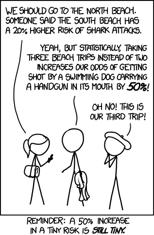
increased risk
7.6 HOMEWORK 7.1
Select two pairs of categorical variables from the dataset you are using for your coursework assignment. These could be variables you have selected for your coursework assignment if you wish. Then run one crosstabulation for each of these two pairs. Report appropriate statistics and interpret your results for these two crosstabulations.